VC's Artwork and Fanart Thread

VirusChris · 240228

0 Members and 2 Guests are viewing this topic.

Offline VirusChris

  • Virakin of the Darkness Arcana
  • Neo Arcadian
  • *
    • Posts: 1737
    • Gender: Male
  • I'm the guy people hate
    • View Profile
Reply #575 on: October 23, 2011, 10:18:06 PM
^I see, well I'll look around on the official site.

Chris Yuushi 091511:


Hey there! Here's another drawing of Chris, except this version is the old Trident-Hairstyle version for the "The Legendary
Heroes" RPG series, "VirusChris/Virakins" manga series, and "Virakin Advent" Action Platformer series and I completed this
drawing on Sept. 15, 2011 as the title states.

I finally manage to update the Trident-Hairstyle again by looking at various different hairstyle and applying a little bit of
Akira Toriyama's style in the mix to get this!

His hair looks more natural now doesn't it compare to his old drawings of it. The hair is no longer bigger or taller than his
head as before and it suits him well. This is definitely his best look yet, and I hope the hoodie jacket he's wearing is in good
detail as well. Though I wonder if the front bangs covering his forehead could be improved on, but what do you think?

And on an unrelated note I drew an eye combining Toriyama's style and my art style I'm using.

Posted on: September 16, 2011, 06:28:10 AM
Seriously? No one has no comment on the new hairstyle of Chris? Anyway...

DBZ - Original Character WIP:


Hey there guys! Here's a digitally drawing of my original DBZ character, based off of my character Chris, and his a Half-Saiyan Half-Human.

I've been inspire to draw my own original Saiyan after seeing the Create-a-Character mode in the new DBZ game, Dragon Ball : Ultimate Tenkaichi, and so this is what I want my character to look like in Hero Mode. He's about 16 -17 years old and somehow gets suck into the DBZ world, but in a parallel universe (as Ultimate Tenkaichi has it set for the story I'm just adding in some more details) and is capable of going into Super Saiyan 1, 2 and 4 (in Ultimate Tenkaichi it's only confirm for SSJ1).

Currently he's incomplete as I haven't finish drawing in his other hand and the rest of his outfit with his legs and boots. But I'll definitely try to finish it before the game comes out on Tuesday this week (October 25, 2011). He has blue eyes, black hair, black fingerless gloves, a Gi with the top part red and the bottom part blue, black boots with white ropes (that's the lace of the boots, right?), and a black t-shirt underneath the Gi.

I made this drawing using Paint Tool SAI and with my Tablet as it's my first real attempt to digitally drawing a full body drawing of my characters. Hopefully it looks good so far!


"Spirit-Soul Fusion! Invoke... VIRUS CROSS!!!" ~ Quote from my Virakins global project
JP PSN: UirusuKurisu
Official Husband of Fox Caster from Fate/Extra <3


Offline Quickman

  • Crystal Clod and
  • RPM Sorcerer
  • ****
    • Posts: 29820
    • Gender: Female
  • Classy clod
    • View Profile
    • B. Roth Arts
Reply #576 on: October 24, 2011, 04:24:30 AM
Now that I have seen the hairstyle...  I like it.  I like this version of the trident hairstyle.  The cowlick on the back of the neck was a nice touch.

And as for the digital sketch... The linework is pretty tight.  Though, I wonder... When drawing a figure, do you sketch out the bare bones (a glorified stick figure) of the pose prior to fleshing out all the details?  Or do you go straight to the final touches and skip the other steps?  If you use simple sketches to build a pose on paper, you can do the same digitally.  I often start my digital pics off with a simple, quick sketch of the pose in a light blue on the background layer.  Then, I add a new layer and start fleshing it out.  Because one works digitally doesn't mean they need to change how they draw.


Offline VirusChris

  • Virakin of the Darkness Arcana
  • Neo Arcadian
  • *
    • Posts: 1737
    • Gender: Male
  • I'm the guy people hate
    • View Profile
Reply #577 on: April 30, 2012, 11:51:33 PM
Now that I have seen the hairstyle...  I like it.  I like this version of the trident hairstyle.  The cowlick on the back of the neck was a nice touch.

And as for the digital sketch... The linework is pretty tight.  Though, I wonder... When drawing a figure, do you sketch out the bare bones (a glorified stick figure) of the pose prior to fleshing out all the details?  Or do you go straight to the final touches and skip the other steps?  If you use simple sketches to build a pose on paper, you can do the same digitally.  I often start my digital pics off with a simple, quick sketch of the pose in a light blue on the background layer.  Then, I add a new layer and start fleshing it out.  Because one works digitally doesn't mean they need to change how they draw.

The cowlick at the back... I kinda wasn't thinking on that part, just went with the flow of how the hair's line was drawn and I liked it! This is the best look so far for the Trident hairstyle and I think I'll make it the final official one, hard to find a way to improve it now.

Thanks for the comment on the digitally sketch! I didn't show it as I hide it in SAI, but I made a blue sketch to position the body parts (you know the circles, ovans, lines, etc.) to set up how I want my guy to look and then another layer I started drawing the clothes and and facial expressions (the facial expressions on another layer with a different color so I can change the face without messing up the lines of the head).

I'm looking for some reference to his stance with some DBZ-style in it and I have ALL 26 DBZ manga volumes to look at and get a rough idea how to draw him. So far I'm having a tough time with the arms and pants as I'm not use to drawing full body characters, especially DBZ style, and I'm getting more familiar with the Tablet. Still need some more work though.

Also I did ALL the lineart by hand, I haven't used the Vector layer yet. Going to be a while before I color and shade in the drawing digitally.

Thanks for your feedback!

Posted on: October 24, 2011, 05:22:06 AM
I wonder if it's time for me to reveal this? I wonder if my sprite skills have improved a lot?

Reimu Hakurei RMVX-Style Sprite WIP:


Hey there! This is my first, well second if you count the early fanart Touhou character, Touhou artwork uploaded here!
This is a sprite I've made of Reimu Hakurei, the main character of the popular Japanese-only PC "Bullet Hell" games called
"Touhou" created by ZUN.

However I'm uploading this, because I want your opinions about which sprite version of Reimu I should use.

I'm planning on making a Touhou RPG game and my project will be made with the RPG Maker VX which is what style I'm
using to make this sprite, with my own touch. I plan to create almost all the important/well-known Touhou characters
from the series including the recent cast from Touhou 13: Ten Desires.

From left to right is a dark brown/regular brown haired Reimu with one slight brownish/red eyes on the left and complete
red eyes on the right. The same is held true for the other two on the right except they have black hair instead.

I want to get it as close as possible to what she really looks like, officially or a close second. I made the brown-colored
hair version Reimu first, but then made a black-haired variation to see if she looks better with black hair.

She officially has dark brown hair by Touhou 13, but her black hair look looks more comfortable on the eyes and such.

So I ask you, which one of the four sprites of Reimu should I use?

Please note I'm still working on her sprite sheet, so this is her only sprite frame done. I hope in the future I'll get ALL of the
ones I want done and/or get help making the rest of the Touhou cast as well as releasing them for other people to use in
their own Touhou RPG projects if they want. But please credit or cite your source, I'm working hard on these.

Though it took me about an hour I think to work over the Female Sprite template to get her first sprite done.

Also any ways to improve it? I try to get it detailed as possible while keeping the pseudo-VX sprite style of the RMVX program.
It's pretty hard to make the detached sleeves on her sprite without making it weird.

And the color palette to show what colors I used. Tricky to find the right colors, especially getting the darker ones to outline the sprite more.

Comments, opinions, suggestions? Or did you think they're good enough?

Posted on: December 14, 2011, 06:05:44 AM
Reimu Hakurei VX-Sprite Sheet


This is my complete RPG Maker VX-Style Sprite Sheet of Reimu Hakurei! Took me awhile to finish it, but I got her done!
Also, thanks to the people who picked which Reimu was better from my previous one of the WIP sheet... the third Reimu
was chosen.

I have to say it was tricky figuring out how her back should look, but I managed it somehow. I have to say it looks great
and I'm proud to have finished it! ^_^

Now there's like 60+ Touhou characters to sprite. @_@

Well my complete sprite sheet of Reimu is done and I'll allowing anyone to use it for their own Touhou RPG projects, just
give proper credit please.

I forgot to add in Reimu's alternate costume or second costume, which gives her purple hair and purple eyes as a throwback
to the original PC-98 games and I plan for my Touhou RPG for all females to have at least 8 different costumes. I plan to have
a lot of Touhou references to old games and sources.

I have planned Reimu's default look, alternative costume, schoolgirl outfit, and swimsuit costumes. Every Touhou will have a
school-theme outfit.

Tell me what you think, is there anyway for me to improve upon what I've got here?


Chris Corona VX-Style Sprite
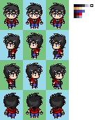

Hello everyone, this is a RPG Maker VX-Style Sprite of my original Chris Corona. I use this avatar of him for his other alternative
universe version of himself (excluding "The Legendary Heroes" RPG series, "VirusChris/Virakin" manga project, and "Virakin Advent"
series).

I finished him a while back, but I went back and updated him a little by making his hair darker (it was much lighter), more details
on his clothes as well as darken them, and fixing up his hair a bit.

If you can't see it, I made a necklace for him on his sprite but you probably need to download to get a better look at it.

He's the Protagonist of many stories I have about him (each different in their own way), and I plan to have him appear in a game I have
planned where the player can change his name (it's his default name) and choose various sayings and something interesting about his
history that affect the scenario in certain ways.

I used 21 different colors to make him, so it took a while to get him right especially his hair which was the hardest one to sprite.

Tell me what you think, OK? Do you see any areas I should touch up upon to fix or improve?


Are surprised no one is commenting on the Touhou Sprites at least... saying as some of you guys love Touhou. -u-'


Posted on: December 16, 2011, 04:06:33 AM
I'm completely astonished that no one commented on the Reimu Sprite at least! Give a guy a bone, already! :|

Anyway here's some links to my fanfic stories I made and uploaded to FanFiction.net:

DARKSTALKERS: Dawn of a New Breed (Hiatus)
Dead or Alive: Destiny (Hiatus - Rewrite planned)
Fate/Extra: Corona Fox (Currently working on)
LaTale: Tales of Corona (Hiatus)
Mega Man AXL: Zero Era (Completed)
Mega Man AXL: Zero Era 2 (Hiatus)
Princess Resurrection: Boy and a Weregirl (Completed)
Tales of the Abyss: Corona Soul (Hiatus - Rewrite planned)
Yu-gi-oh! 5D's Tag Force 4: Misty Storyline (Semi-Complete, one chapter missing and incomplete duels)


I'm opted some other stories I have for various reasons. Anyway check them out when you have time, but please note I plan to go back on my old stories and fix them up and updated them.

Posted on: December 26, 2011, 06:11:26 AM
I've been working on a Fate/Extra fanfic recently and I've just uploaded the 7th chapter to my story today, that being Chapter 5 in the fanfic.

Chapter 5: Thy Enemy is my Old Friend

Please take a look at it! I've been busy with work a lot last week so hopefully this week I can get some drawings done!

Posted on: April 09, 2012, 03:36:18 AM
I can't believe I'm actually going to post this, but it IS my first true complete digitally colored artwork. I also wanted to do a simple and easy character that's not to complex to draw which is why I wanted to draw this kind of character:
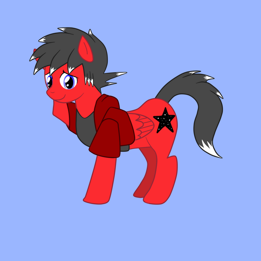


This is my own original character, Crimson, based on the My Little Pony: Friendship is Magic. Yes, I've watched the MLP series and I'll be frank... I like the series and now I'm a brony and I'm not afraid to admit it. I've draw Crimson in Paint Tool SAI and used my Wacom Tablet to draw and color him in, and I used Photoshop to make his gradient eyes. I based his mane after my character Chris Corona because I wanted to have a unique kind of mane for this pony character and a few other reasons as well.

If you want to learn more details and my character's description, click on the picture. I have a story in mind for my character as well, and sadly I won't write it until I've draw his little dragon companion, Glitterrock the female black baby/kid dragon, if you're interest in learning about my character.

Hope you like it, but I know the flaw in my drawing is that he's body is too long for the pony in the show which I kinda dislike about what I did to my drawing.


"Spirit-Soul Fusion! Invoke... VIRUS CROSS!!!" ~ Quote from my Virakins global project
JP PSN: UirusuKurisu
Official Husband of Fox Caster from Fate/Extra <3


Offline Quickman

  • Crystal Clod and
  • RPM Sorcerer
  • ****
    • Posts: 29820
    • Gender: Female
  • Classy clod
    • View Profile
    • B. Roth Arts
Reply #578 on: May 01, 2012, 08:39:36 AM
Even though I hate the animation style of MLP:FIM (I prefer the original), that is a cute pony and you've captured the style very well.


Offline VirusChris

  • Virakin of the Darkness Arcana
  • Neo Arcadian
  • *
    • Posts: 1737
    • Gender: Male
  • I'm the guy people hate
    • View Profile
Reply #579 on: May 07, 2012, 08:32:33 PM
Even though I hate the animation style of MLP:FIM (I prefer the original), that is a cute pony and you've captured the style very well.

Why thank you! Trying to get more practice in with my Tablet and learning about Paint Tool SAI to improve my drawing skill.
I had to look at a tutorial figure out how to capture the style as the same as MLP: FiM art style.

Though I do wish I've got some feedback on my sprites, but oh well.


Next up on my list! I'm going to try to draw my character Chris Corona, complete in anime style with colors, should be fun especially with the frosted-tip hair! Now I need to find a good tutorial on making anime characters in Paint Tool SAI.

Posted on: May 01, 2012, 08:02:48 AM
Chris Corona - Full Body WIP:


Finally! After several hours working on him, or days as I had work and such so I couldn't be on top of my drawing all the time,
I finally finished drawing my sketch of my original character Chris Corona! This is the main character of my various stories and
this is what he looks like and his originally appearance was going to appear like in my LaTale story! That where his initial design
came and was designed from and I further expanded upon it!

The picture was so big I had to draw on a second sheet of paper as I didn't have room to draw the feet!

Just to let you know this is a rather incomplete drawing of him though, as I didn't get the chance to add the socks and his necklace
onto him at this point. I plan on adding them on via in Paint Tool SAI to digitally ink and color him and having his body ready for a
base makes it easy, that and I don't want to keep on erasing and drawing over and over again making a mess of the drawing.

On the left side of the drawing, you can see the design of his family heirloom necklace I made for him, the 8-Point Star Yin & Yang Pendant.
Actually several designs, with it being slightly more complex with each half of the pendant in black and white had a smaller white and black
coloring to the opposite of them but it was too small to do and too crowded which is why I keep it as a 8-Point Star pendant with the
Yin & Yang symbol in the middle with just half of the star the other color making it simply yet unique at the same time.

In one of my stories I have him in, his necklace transforms into several different weapons which he uses to fight. However his family
heirloom didn't have this ability prior and only until he sudden "disappearance" in another world did this power occur, but it didn't happen
when he got there or when he was traveling there. I'll leave that out for another time.

It was hard drawing him at times, but I wanted to draw his pose! It was so tricky finding good reference materials for the hand on the
hip pose with his left hand and ESPECIALLY for the right foot pointing upward into the sky little pose he has there and I had to imagine
what it would look like in my head and I had to use my own sneakers to get a rough idea. That includes the fingerless gloves as well as
I used the ones my uncle got me as reference to design his fingerless gloves, though I think the left hand one is awkward due to the pose.

This is also the first time I've drawn sneakers with these laces on this time, I usually just go with strap on's to make it easier and simpler.
I really like how I designed his short-sleeved hoodie he wears, and strangely you don't see that type of hoodie anywhere on deviantart or
in real life, and I had to use my own long-sleeved hoodie as a reference.

I went with a more cargo look for the shorts. However the shorts are shorter than I thought after finishing the drawing so I'm going to make
them longer, they were suppose to cover half of his knees or all of it. I didn't put socks on him as the picture divided from the end of his
legs to the start of his feet so I decided to add those in later.

Truth be told I feel a little unsatisfied with my drawing as I well I could do more for it and that I feel like I messed up on some areas like his
arm and definitely his right leg. That's why I'm going to touch up in Paint Tool SAI and fix that! I mean it looks unnatural and awkward so I
need to move it outward to his right more to make it look more natural and better!

I should take me a few more hours to fix up the errors, tweak it around, digitally ink it and finally color him. Should be fun and I can't wait
until he is done!

Please give me some feedback on him!


"Spirit-Soul Fusion! Invoke... VIRUS CROSS!!!" ~ Quote from my Virakins global project
JP PSN: UirusuKurisu
Official Husband of Fox Caster from Fate/Extra <3


Offline KoiDrake

  • SA-Class Hunter
  • *
    • Posts: 981
    • Gender: Male
    • View Profile
    • DeviantArt
Reply #580 on: May 08, 2012, 12:57:08 AM
You make long posts, so I'm not sure if you addressed any of these stuff, but when I read "feedback" and I always try to deliver:

From the waist and up it doesn't look half bad actually. Besides the left hand, which looks a bit awkward, and probably some small things with his jacket, the rest looks pretty good.

Now, from waist to feet, I'm afraid that it's the complete opposite. The proportions of the legs are horribly effed up, they look out of proportion (too big!) and the knees should be way lower than that. The perspective of the knees are really bad too, which makes it look really flat and broken. There are some other things about the legs, but I guess they may be related to the things I already mentioned in a way, so unless you get back to it and fix those issues then I'll keep them on hold. Lastly, he seems to have a small crotch too.

And random question time. Are you left handed by any chance?


Offline VirusChris

  • Virakin of the Darkness Arcana
  • Neo Arcadian
  • *
    • Posts: 1737
    • Gender: Male
  • I'm the guy people hate
    • View Profile
Reply #581 on: May 08, 2012, 01:15:20 AM
You make long posts, so I'm not sure if you addressed any of these stuff, but when I read "feedback" and I always try to deliver:

From the waist and up it doesn't look half bad actually. Besides the left hand, which looks a bit awkward, and probably some small things with his jacket, the rest looks pretty good.

Now, from waist to feet, I'm afraid that it's the complete opposite. The proportions of the legs are horribly effed up, they look out of proportion (too big!) and the knees should be way lower than that. The perspective of the knees are really bad too, which makes it look really flat and broken. There are some other things about the legs, but I guess they may be related to the things I already mentioned in a way, so unless you get back to it and fix those issues then I'll keep them on hold. Lastly, he seems to have a small crotch too.

And random question time. Are you left handed by any chance?

I know I messed up on the legs, but I ran out of room and such and had to draw on a second sheet of paper. I plan to go back to them and fix them up as well as make the shorts a tad longer so they cover the knees or half of it at least. Then I have to move the right leg further away to look more natural and a few other things. I actually don't think the legs are too big, but I plan to make them a bit smaller in width but not too small. True, now that you mentioned it and I took another look at it the knee ARE too high up.

About the left hand, I try many times but it keep on looking really weird when I drew it so I had to make due with what I had there and possibly fix it up later. Exactly what are the small things with the jacket? I like to make sure I correct those in the future. And what crotch? I just folds in the shorts, I look at another picture with cargo shorts as reference and that's what it had... I really don't understand that bit. But I guess I can lower the bottom of the shorts a bit since it does looks weird.

And no, I'm not left-handed but I can draw and write with my left hand but not as good as my right. I have to move slowly to be accurate with my writing and drawing.


"Spirit-Soul Fusion! Invoke... VIRUS CROSS!!!" ~ Quote from my Virakins global project
JP PSN: UirusuKurisu
Official Husband of Fox Caster from Fate/Extra <3


Offline Quickman

  • Crystal Clod and
  • RPM Sorcerer
  • ****
    • Posts: 29820
    • Gender: Female
  • Classy clod
    • View Profile
    • B. Roth Arts
Reply #582 on: May 08, 2012, 10:41:57 AM
Hoo boy... feet and hands.  They are hard to draw.  The best method for learning how to draw them is to either model your own hands and feet or ask someone to model for you.  I noticed that the right shoe is a bit off.  There are several ways that you can remedy this, the easiest being to reference your own shoe.  Position your shoe as it is in the pic and draw what you see.

Another method I learned was lightly sketching the foot as a floppy figure-8.  Then, after some study of how feet are built, add on the basic shape of the foot.  This works for shod feet as well as bare.  The figure-8 helps with positioning.  Picture the 8 on a plane and imagine looking at that flat 8 from different angles.  Heck, draw that 8 from different angles, then build the foot on top of it. 

To add to Koi's feedback... Concerning the crotch.  It is too high.  Specifically, he has no crotch.  Now, the reference you used... was someone wearing those shorts?  How low toward their knees was the crotch?  Cargo shorts for men have roomier crotches, as, well... Men need the room in the crotch. :P  With the crotch as high and close to the bottom hem of the shirt that it is, it makes it look like he either has no crotch or his torso is strangely short.  There would be no room for his ribs.  In fact, if I were to trace out his anatomy, he would have no waist, as his ribs would connect with the hips.

Also, a person's thighs are longer than their lower legs.  The femur is the longest bone in our body.  I advise investing in some photo reference books.  The Comic Artist's Photo Reference is a good book, if you're uncomfortable about having nude references.  All the guys and girls are wearing underwear. :P  Though, don't discount the wealth of reference you would get from a book of art nudes.

Curious, how do you start a sketch?  Do you lightly sketch out the pose and proportions before tightening everything up and working on the actual pic?  Or do you do the final sketch straight off?  If it's the latter, I recommend starting your drawings with a lightly-sketched pose.  This way, you can work on the proportion and anatomy.  It will also allow you to draw by mass, rather than by line.  You'll see how a figure takes up space on a two-dimensional plane.  This method is what all artists use and it's one of the first things that are taught in art guides, including the manga guides.


Offline VirusChris

  • Virakin of the Darkness Arcana
  • Neo Arcadian
  • *
    • Posts: 1737
    • Gender: Male
  • I'm the guy people hate
    • View Profile
Reply #583 on: May 08, 2012, 11:00:50 AM
I used this picture as a reference to the cargo shorts:
http://viruschris.deviantart.com/favourites/#/d433t6w

And I start my sketches with the head first and try my best to do light strokes, but I have a bad habit of getting too into my sketch that I start defining the details like once the head sketch is complete I start adding the eyes, hair, nose, mouth, and such and I tend to draw darker when I should try to sketch out the rest. With this sketch I didn't really layout the pose, I just had it in my mind and start sketching one body piece at a time.

I started with the head, torso, thighs, legs, arms, hands, and then feet in that order with my drawing. I'm already fine-tuning it in Paint Tool SAI, with the shorts longer and the crotch area lower from the top making it look more natural and I re-drew his left leg differently.

I've been trying to get his legs nice and thin, but not too small but not too big... kinda like Sakuya's legs:


Still can't seem to get it and I don't see any other character in the same pose as my character. I appreciate the feedback, this will help me to fix my drawing and make it look even better!


"Spirit-Soul Fusion! Invoke... VIRUS CROSS!!!" ~ Quote from my Virakins global project
JP PSN: UirusuKurisu
Official Husband of Fox Caster from Fate/Extra <3


Offline Quickman

  • Crystal Clod and
  • RPM Sorcerer
  • ****
    • Posts: 29820
    • Gender: Female
  • Classy clod
    • View Profile
    • B. Roth Arts
Reply #584 on: May 08, 2012, 11:22:23 AM
Well, there's your problem.  You're not referencing to real people. :P 

Proportions are better studied on real people.  The third reference pic, her lower legs are too long.  I have long legs and my ankles are where the cuffs of her socks begin.  I also noticed that you're trying to apply female proportions and balance to a male drawing.  Men have a different center of balance than women do, and their pelvises are shaped differently.  Thus, they stand differently.  They also walk differently.  If you're drawing a male character, it would be better if you referenced from a male.


Offline VirusChris

  • Virakin of the Darkness Arcana
  • Neo Arcadian
  • *
    • Posts: 1737
    • Gender: Male
  • I'm the guy people hate
    • View Profile
Reply #585 on: May 08, 2012, 07:27:51 PM
Well, there's your problem.  You're not referencing to real people. :P 

Proportions are better studied on real people.  The third reference pic, her lower legs are too long.  I have long legs and my ankles are where the cuffs of her socks begin.  I also noticed that you're trying to apply female proportions and balance to a male drawing.  Men have a different center of balance than women do, and their pelvises are shaped differently.  Thus, they stand differently.  They also walk differently.  If you're drawing a male character, it would be better if you referenced from a male.


Well my character isn't really a REAL person and the proportions can be different, I mean it's possible to make someone with super long legs if they want. I was trying to add a sort of "feminine" quality to him as he gets poked by his friends for looking like a girl almost, plus I've been using Tokio from dothack and Sora from Kingdom Hearts as other references to making a male character:


I mean they're legs are pretty slim, which is what I'm trying to get that sort of appearance in. Heck, even One Piece has its wonky drawing style of the characters, though I'm not sure I'm that good yet to draw such characters.

My character isn't suppose to look buff or all-powerful, just a simple and somewhat scrawny teenage. Now that I've taken a better look at Sora's legs, I made the calves of Chris' leg too big so I need to trim that down until I get the balance part. I'll show you the next version of my WIP when I finish ironing out the details, before digitally inking and coloring it for the final process.


"Spirit-Soul Fusion! Invoke... VIRUS CROSS!!!" ~ Quote from my Virakins global project
JP PSN: UirusuKurisu
Official Husband of Fox Caster from Fate/Extra <3


Offline lizardcommando

  • B-Class Hunter
  • *
    • Posts: 373
    • Gender: Male
    • View Profile
    • Lizardcommando's Youtube Page
Reply #586 on: May 08, 2012, 08:33:14 PM
Well my character isn't really a REAL person and the proportions can be different, I mean it's possible to make someone with super long legs if they want.

You'd still want to use real people for reference just to get the basic proportions right though.


Offline VirusChris

  • Virakin of the Darkness Arcana
  • Neo Arcadian
  • *
    • Posts: 1737
    • Gender: Male
  • I'm the guy people hate
    • View Profile
Reply #587 on: May 09, 2012, 04:17:22 AM
You'd still want to use real people for reference just to get the basic proportions right though.

Hehe, true. He IS still a human character so it's good to use real people as reference to get the position and body proportions right before going crazy with that. I wasn't saying it wasn't unnecessary or whatnot, I was just pointing out the some characters in other stories with different styles have humans in different shapes and sizes. Like the America cartoon show "King of the Hill" with Hank's father without any shins as they were blown off in WW2 by a Japanese machine gun, and well it's a little strange (however, even if it's a cartoon, how did they reattach his feet back to the rest of his legs?) given the length of it and such.

However I'm usually alone in the house and I don't have a mirror in my room, and I have to imagine as best as I can when I try to position some of my body parts to draw the poses I have in my head for my character to have. I sometimes wish I had one of those mannequins to use for reference for poses, you know I wonder why haven't anyone try to make a virtual version of them for artists to use?

I also use my Anatomy book for body reference as well to make sure I have them correct and such. I'll post version two of my drawing when it's done.


"Spirit-Soul Fusion! Invoke... VIRUS CROSS!!!" ~ Quote from my Virakins global project
JP PSN: UirusuKurisu
Official Husband of Fox Caster from Fate/Extra <3


Offline KoiDrake

  • SA-Class Hunter
  • *
    • Posts: 981
    • Gender: Male
    • View Profile
    • DeviantArt
Reply #588 on: May 09, 2012, 04:31:01 AM

Well my character isn't really a REAL person and the proportions can be different, I mean it's possible to make someone with super long legs if they want. I was trying to add a sort of "feminine" quality to him as he gets poked by his friends for looking like a girl almost, plus I've been using Tokio from dothack and Sora from Kingdom Hearts as other references to making a male character:


I mean they're legs are pretty slim, which is what I'm trying to get that sort of appearance in. Heck, even One Piece has its wonky drawing style of the characters, though I'm not sure I'm that good yet to draw such characters.

My character isn't suppose to look buff or all-powerful, just a simple and somewhat scrawny teenage. Now that I've taken a better look at Sora's legs, I made the calves of Chris' leg too big so I need to trim that down until I get the balance part. I'll show you the next version of my WIP when I finish ironing out the details, before digitally inking and coloring it for the final process.
"You have to know the rules to break them". That means that if you want to distort proportions, you still need to make it in a way that makes sense, and to do that you must know some basic proportions before you try anything weird like that.

And thanks Quickman for covering me, the crotch thing was exactly what I meant and I see you exxplained a lot better the proportions of the legs, so you really saved me some time on that :)

I'll try to get some draw-over of that drawing tomorrow, I find it better to explain proportion issues by doing that rather than explaining it with words.


Offline Quickman

  • Crystal Clod and
  • RPM Sorcerer
  • ****
    • Posts: 29820
    • Gender: Female
  • Classy clod
    • View Profile
    • B. Roth Arts
Reply #589 on: May 09, 2012, 06:16:53 AM
Ditto, as earlier I had sketched the pose.  I'll scan it tomorrow evening.  This evening, I was feeling sick and napped.


Offline VirusChris

  • Virakin of the Darkness Arcana
  • Neo Arcadian
  • *
    • Posts: 1737
    • Gender: Male
  • I'm the guy people hate
    • View Profile
Reply #590 on: May 09, 2012, 06:23:01 AM
Ditto, as earlier I had sketched the pose.  I'll scan it tomorrow evening.  This evening, I was feeling sick and napped.

Are you referring Koi or my drawing's pose? Any help would be appreciated!


"Spirit-Soul Fusion! Invoke... VIRUS CROSS!!!" ~ Quote from my Virakins global project
JP PSN: UirusuKurisu
Official Husband of Fox Caster from Fate/Extra <3


Offline Quickman

  • Crystal Clod and
  • RPM Sorcerer
  • ****
    • Posts: 29820
    • Gender: Female
  • Classy clod
    • View Profile
    • B. Roth Arts
Reply #591 on: May 09, 2012, 06:36:01 AM
Koi is referring to sketching the current proportions of your character's pose, while I was referring to drawing your character's pose with the right proportions.  At least, that's what I assume Koi meant.


Offline KoiDrake

  • SA-Class Hunter
  • *
    • Posts: 981
    • Gender: Male
    • View Profile
    • DeviantArt
Reply #592 on: May 09, 2012, 07:55:13 PM
Nope, I meant the later, draw the correct proportions/pose over the original, but if you're doing it then go ahead, I'm kinda busy at the moment :P


Offline Quickman

  • Crystal Clod and
  • RPM Sorcerer
  • ****
    • Posts: 29820
    • Gender: Female
  • Classy clod
    • View Profile
    • B. Roth Arts
Reply #593 on: May 10, 2012, 05:49:01 AM
I was sick all day, so I'm not in the mood to scan anything.  If you get to it before me, great.  If not, I'll eventually get around to scanning.


Offline VirusChris

  • Virakin of the Darkness Arcana
  • Neo Arcadian
  • *
    • Posts: 1737
    • Gender: Male
  • I'm the guy people hate
    • View Profile
Reply #594 on: May 10, 2012, 11:40:04 AM
Here's version 2 of my drawing:


Please note, this is the final version or whatever and I manage to get around and add his necklace onto him as well as fix up his legs a bit and did something a little different with the left hand. HOWEVER, I'm still unsatisfied with the legs as I know I can do better and they still look wrong to me. They feel short so I might go back and make them a little longer.

Also I moved the crotch area of the shorts further down as well as extend the length of the shorts to make them slightly longer and to try and cover his knees. The lines are a bit bulky in some areas and the necklace is hard to draw at times due to the angle it's on and how big it's going to be. Might make it bigger or longer.

When I have everything in the way I want I'm going to make a vector layer and do the digitally ink to make it look good and such. So any help would be appreciate to help iron out a few last minute details and correct any errors in my drawing. Please and thank you!


PS: Sorry for the light blue color for the sketch, usually in drawing the blue colored lines are used for sketches and such.


"Spirit-Soul Fusion! Invoke... VIRUS CROSS!!!" ~ Quote from my Virakins global project
JP PSN: UirusuKurisu
Official Husband of Fox Caster from Fate/Extra <3


Offline Quickman

  • Crystal Clod and
  • RPM Sorcerer
  • ****
    • Posts: 29820
    • Gender: Female
  • Classy clod
    • View Profile
    • B. Roth Arts
Reply #595 on: May 11, 2012, 05:53:53 AM
His thighs are still too short and his knees are still too high.  From what I can discern is that you're piecemealing from several images and trying to put together the pose and concentrate on the finished linework first thing.  To build adequate proportion, you should lightly sketch the basic pose first, then work on the details. 


This is what I meant by sketching the pose.  Note how there is absolutely no detail, aside from a simplified musculature.  It is drawn loosely, (and usually lightly, but I darkened it for the example) so that any mistakes can be easily corrected without having to redo the entire drawing.  This also serves as a guideline, so that you can see how clothing and fabrics will fold and hang on your character.  Remember, your characters have weight, and they will displace space.  If you can't draw their mass in the basic sketch, no amount of shading will give them form and depth.  I've seen this before; people will concentrate on their shading and coloring and have the drawing almost photorealistic, but the drawing, no matter the depth of shading, still looks flat.  That's because the artist never learned how to draw mass.

Most art guides will describe a drawing process similar to the sketch above.  Some may do it a bit differently.  Mine is based on Drawing Comics the Marvel Way.  But, they all boil down to the same principles exemplified above: Action line for the direction of movement, and a simplified anatomy for proportion and mass. 

Try starting off your drawings not with the finished linework (as what you're doing now is just drawing the same thing twice), but with a simplified sketch.  It's quicker, you can draw quickly and more loosely, add fluidity and motion, and be able to see how the various aspects of the body work together.  When you view references, break them down into their basic shapes and see how they fit together.


Offline VirusChris

  • Virakin of the Darkness Arcana
  • Neo Arcadian
  • *
    • Posts: 1737
    • Gender: Male
  • I'm the guy people hate
    • View Profile
Reply #596 on: May 11, 2012, 06:32:32 AM
I see... so the thigh is still too small and the knees too high? Though I'm not going with a Marvel-style appearance for my dude, I see where you're getting at with the anatomy. I'll try doing the poses with simple skeletons to help with the pose first before sketching the rest of the details, however it's a bad habit of mine to continue drawing in one area when I envision the part I like to get down.

Honestly though it's tough finding your own style, like the One Piece series as it goes crazy with the character designs that it seems to throw out most human anatomy (but still keeping it in a sense) like that one dude with crazy arms with all those bends in them and such. And it's tricky to draw thin legs for my character as well.

So that's all that's left that's wrong with my drawing? What about his left arm and hand? Those are OK? I'm still wondering if I can improve them somehow.


"Spirit-Soul Fusion! Invoke... VIRUS CROSS!!!" ~ Quote from my Virakins global project
JP PSN: UirusuKurisu
Official Husband of Fox Caster from Fate/Extra <3


Offline Quickman

  • Crystal Clod and
  • RPM Sorcerer
  • ****
    • Posts: 29820
    • Gender: Female
  • Classy clod
    • View Profile
    • B. Roth Arts
Reply #597 on: May 11, 2012, 06:51:11 AM
His right (your left) forearm is a bit on the short side.  Your foot is the same length as your forearm, from elbow to wrist.  If you have the forearm and the foot size the same, that usually helps correct that problem.  Also, the arm (upper arm), much like the thigh, is longer than the forearm.  What I'm noticing now is he doesn't really have any curve to his spine; it's very straight.  

When you get a chance, go into your bathroom and stand before your mirror in that pose.  Nevermind the lower body for now, focus on the torso.  It also helps (seriously!) if you do this shirtless, as you can see how the body bends.  Stand in that pose and study how your ribs sit, how your hips sit, how your torso and neck are positioned, and where your shoulders are.  

His left (your right) shoulder is rolled too far forward, and it should be slightly higher than his right (your left) shoulder.  His hand on his hip pushes the shoulder up, whereas his other hand is hanging free and his shoulder is a bit more slack.

The human body is not something that you can copy-paste from different pictures.  One needs to learn how the body works in concert first, and then they can put together poses from bits and pieces.  Also, even manga books will tell you to build your poses like my example.  Theirs will be more simplified, but the basic structure is still the same.


Offline VirusChris

  • Virakin of the Darkness Arcana
  • Neo Arcadian
  • *
    • Posts: 1737
    • Gender: Male
  • I'm the guy people hate
    • View Profile
Reply #598 on: May 11, 2012, 07:12:47 AM
Ah, I see! Funny thing is, I've done that posing in front of the bathroom mirror however I'm a little embarrassed to say that I don't have the same 'physique' as my character here but it does help see how the body works.

I'll keep at it until I got it right! I notice now that the left shoulder does move up when his hand is on his hip, I tend to focus at one thing at a time (which was just the hand at the time) which I can see messed up my character's pose a bit. Give me a few to post another update version.

Posted on: May 11, 2012, 05:04:40 AM
Here we go!


A little bit better, right? Still need help with the legs I think... can't seem to get them right.


"Spirit-Soul Fusion! Invoke... VIRUS CROSS!!!" ~ Quote from my Virakins global project
JP PSN: UirusuKurisu
Official Husband of Fox Caster from Fate/Extra <3


Offline Quickman

  • Crystal Clod and
  • RPM Sorcerer
  • ****
    • Posts: 29820
    • Gender: Female
  • Classy clod
    • View Profile
    • B. Roth Arts
Reply #599 on: May 11, 2012, 07:47:18 AM
Extend the thighs passed the shorts.  Though, if you want the shorts to be knee-length, then extend the shorts.  It's getting there, but the thighs are still too short.

Also, instead of redrawing the entire picture over and over again, why not draw the pose?  Draw the pose first, then draw the picture.  Trust me, it is much easier this way.  Here's an example using Asajj Ventress:


Overlooking the issues with her boobs (this is what happens when you try to apply real person proportions to a CGI biped), I drew her pose first.  I grabbed my non-photo blue pencil and sketched it out lightly and quickly, and loosely.  At this stage, don't tighten up your linework, this is the part people usually don't get to see.  Keep everything loose and literally scribble it out.  Hell, scribbling a pose is a method that many people use, as they can whip out the basic sketch in little time.  With Asajj here, I drew her arms as sticks.  She was literally a stick figure, and that was only to get the basic pose.  Then, I added a simplified musculature.  After I was satisfied, I then got a different pencil and started tightening everything up.

It may seem unnecessarily complicated or even arbitrary, but this method is the same method that artists use everywhere, even in manga.  The proportions may be different, but the method is exactly the same.  I use the same exact method for digital art, as well.  Light blue quick sketch of the pose to start, then switch to black on another layer for the linework.  It doesn't matter with what you're drawing, the method of putting together the human (or even inhuman) body is still the same.